"Put off the finish as it takes a lifetime - wait until later to try to finish things - make a lot of starts."
-Charles Hawthorne
Ok, I've been doing these little exercises I call digital starts and I thought they might be useful to some others as well.
So what's a "start" anyway? Well, Kevin Macpherson really emphasizes the start of a painting as critical to the finished painting. It's the block-in of a painting. For Sarback, it's stage 1 and 2 and also of critical importance. For anyone of Cape Cod School thinking it's basically just putting in the major masses (few in number!) at the beginning of any painting. You reduce everything to it's basic masses of color. All the while you are asking "Is this basic mass, light/darker, warmer/cooler, more/less intense (chroma, saturation) that the one next to it?" You keep adjusting the masses with these questions until they are in proper relation to each other. Hensche might say adjust this until the "light key" emerges. I feel it is THE exercise (whatever the medium): judging one color against another.
"It is so hard and long before a student comes to a realization that these [first] few large simple spots in right relations are the most important things in the study of painting. They are the fundamentals of all painting." -Charles Hawthorne
Hawthorne and Hensche were devoted to it. While painting schools were indulging in abstract art or tonal based painting, these guys were saying it's the judgment of color that is crucial in painting. Their students would do these basic starts all the time and rarely ever get into detail. Hawthorn did it with mudheads, Hensche with block studies.
I've come to believe in this zealously too, but simply don't have the time/patience to do endless block studies (or Hensche to make me do them).
What do I have? I have some 2 hour time slots in which I can get a an actual small oil painting done, but I have a lot of is 15-30 min time slots (modern life eh?) between doing all the other crap in my life I gotta do. So I tried to figure out a way to exercise my eyeball during these little time slots. Oil painting time is all in the setup and clean up for me (ugh!), so I starting trying to do these color judging exercises in photoshop.
Disclaimer: Let me throw out that I realize nothing compares to judging spots of color next to each other en plein air. If fact, doing these little color starts of photographs has only taught me this more. There's a lot more color and range out eyes can see that what a camera can pick up. That said I still think this is really useful because it does still exercise that basic muscle of judging one color against another.
So, here's what I do (finally!):
Find any image or more commonly a piece of an image that you think you can divide into a few colors masses (blur and squint to judge this). Don't worry about content, or making a pretty picture or composition etc. When you squint, are there are there just a few contrasting shape? Got one? Good. Drop it into photoshop.
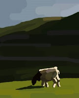
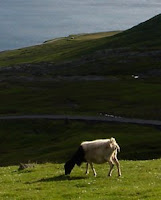 When I squint at this one I see 4 shapes: 1. The water shape up high. 2. the shadow shape that includes the shadow on the goat (squint they blend together) 3. The sunlit grass and 4. the sunlight parts on the goat. If you squint as much as possible you can really see the image group into 2 families: the sunlit shapes and the shapes in shadow.
Now make a duplicate version any way you like (I do this: ctrl+a, ctrl+c, ctrl+n, hit "ok", ctrl+v). We're gunna paint on this duplicate, but let's not cheat so get rid of the color, including value. We just want to see the lines of it so we don't have to draw because not what we're focusing on.
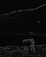
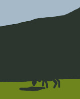
This is just one way to get it to be a simpler line drawing: Filter/Artistic/Photocopy (with detail 1 and Darkness of 50), hit ok. This usually gives me some outlines to paint by. Now I've got this:


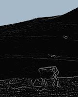
Looks like a dark dull green to me. start a new layer, make your best guess of green and paint it in there. Yup I know it's way off, don't let that stop you , move on.

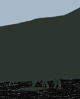


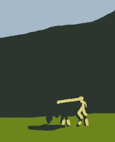
I'm going to start with the shadow shape because it seems the most out of whack. Select that layer and hit cmd+u to bring up the Hue, Saturation, Lightness box. Make sure the preview box is selected and begin to adjust your slider to try to match the color better. Im gunna start by making it much warmer, a little more saturated and a lot darker. That's closer.

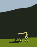
Now I'll select the water shape and adjust it, I'm squinting and I can see it should be darker and I think a little warmer.

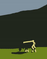
Now the light foreground . I'm judging it should be a little darker, much warmer and maybe a little more chromatic. I also

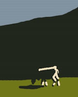
My shadow shapes still seems too light. in messing with that I see that it also needs not only darker, but more saturated and a little warmer.

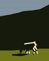
I realize it may not be so pretty, maybe not even fun, but if you have time you can put in some variations into these masses which I think is really fun but can be time consuming. It's where the beauty and magic starts to come together, but remember it's built on the shoulders of the a good start. OK, that's the exercise, but if you're got steam and time, have some fun with variations.
Let's start with the water mass:

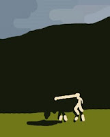
Shadow shape has a bunch and a few to the goat light shape:

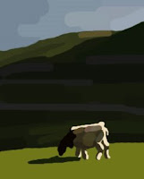
Now some to the foreground shape:

That's it for the variations. We're done (again)!
Whew! I'm tired. I hope that answers some questions and might be useful to some. I'd love any feedback and also any exercises you might do along these lines. :)
Just for reference: From my first post on some digital start examples (at bottom) Here's an example of the original, masses and then variations.


related posts:
What I've Learned (after 120 paintings)
My Setup - All my equipment for painting.
11 comments :
thanks jeff for all your work on this post. i dont have photoshop but i'll just do em small in paint on scrap canvas board. will be good for two things: seeing the differences in masses and then having to match it with paint.
i love the really simplified, graphic nature of the finished excercises. theres a guy painting out in california whose finished paintings have this look. check him out by googleing Tim Horn William Lester Gallery to see his work. thanks again.
BTW if you ever want to paint together i live at the coast near wilmington. let me know.
Hi Jeff
thanks for this post, really interesting exercise. got me thinking a lot. hope all is well with you, I read you'd moved in, Lucky you! i am about to do the same and am just dreading packing, having to set up a new work space etc.
Anyway keep up the great posts and the painting!
Thanks Mike, I'd love to do some lein air with ya. I'm always looking for serious local. I love your work and hope to come to your four man show soon. :)
Thanks Jilly. Good to hear from you again. Hope all is well :)
Fascinating!! Thank you for sharing your facility with technology and your good sense of design. I found that really interesting.
Excellent demonstration.
I keep on coming back to your blog: I remain amazed at the progress you have made, and endlessly envious of just how accurate your colour judgement is, and how much detail you manage to suggest without actually painting it in. It's like magic!
I have embarked on my own 120 paintings scheme, but I only have time every second week, and then only get one or two done, so I fear it's going to take me ages to get anywhere with it! Still, a lot of fun.
I appreciate your little mini-tutorials. They are really useful and I look forward to more. For example, I find that I struggle to modify a block of colour after it is laid in, at least if I work wet-in-wet. I tend to end up with mud. Same thing with trying to paint smaller details on top of existing blocks of colour. Perhaps you can one day show us a step by step series of how your pictures progress.
Another thing I noticed is that you seem to do much more landscape nowadays than you used to. Do you work from photographs? I have tried that, but I find that I positively loathe using photos. It seems to take all the magic out of painting, and I end up sitting there staring at the reference, getting lost in all the detail without a clue as to how even to start. Yet you seem to have a great ability to take almost any little scene and immediately break it down into its essentials. I'm sure lots of your fans here are very curious to know more about your process!
Anyway, keep up the good work. Visiting your blog is always a pleasure and an inspiration.
Brian
http://brianvds.livejournal.com/
Thanks for the kind words guys! Very kind :)
Brian- Good for you! I really feel small and often is the way to make progress. Keep in mind even if you can't spend an hour or two on painting, there are exercises you can do. The one above is trying to get at that. If you are judging one color against another then you are excising and making progress. Sometimes I'll find a photo with only 3 masses (like ground, trees and sky) and do a quick 5 minute exercise.
Good question about photographs. I don't usually like working from them because they seem to lose a lot of color, especially subtle colors in the shadows. However sometimes I don't have the time to setup outside or im in a hurry at the time (or lazy!). Nothing replaces the colors of nature, but I still think it's a good exercise.
Don't let detail distract you. Think big masses first and only then move onto variations within each mass. When I started painting I found I was trying to put in a lot of detail because the painting was missing something and I didn't know what else to do. What it needed was the right colors. When I put the right color spots in, I didn't feel like I needed much detail after that.
Blur (unfocus) your eyes to look at colors and squint to judge value relationships. Do details at the end if you feel you need them. But if you get the right colors in the right places you'll find the object starts to build itself and the viewer's brain finishes the details stuff that the painting only suggests. It really does feel like magic sometimes! Certainly doesn't feel like it all the time, but when it does, there is nothing in the world like it.
I'll make sure and keep up with you blog. :)
Fantastic! I can't wait to try this technique.
I like your idea of having a 1/2 off sale. I might try that some day.
This is a great lesson in seeing the shapes from big to small. I took a class from Peggi Kroll-Roberts a few years back, and this was what she was teaching too - but not in Photoshop. That's a great idea for when you have 15 minutes to practice - now I can't use the excuse that I don't want to drag the paints out :)
Wow- how helpful. You fleshed out what MacPherson explains in his book. You really have a gift for teaching. This is my abslute favorite blog. Thanks so much for sharing info so freely.
Heureka!
I had read your post beginning of the year, did one (!) digital start and.... forgot about it.
Then remembered, but did'nr know where I read about it.
Looked (almost) everywhere...
AND HERE IT IS!
Thanks.
Post a Comment